If you’re a healthcare business owner of any kind and you want greater engagement with your social media or social media ads, one of the most important things to get right is image sizing. It’s also one of the biggest mistakes people make and something that’s continually overlooked. Even major businesses like the BBC still haven’t caught on. But if you want your business’s social media to have the best chance of engaging with customers then read on for a really simple solution.
In the ‘olden days’ we all took pictures in landscape mode, remember what printed out photos looked like? Everything was ‘sideways’. Photo frames were all 6×4:
It was the go-to size because that’s how we consumed pictures. Then came widescreen TVs and again, those of us old enough for VHS would point our recorders sideways so we had that perfect widescreen view. However, times have changed.
We no longer view media in the same ways and certainly, no one is looking at Instagram on a widescreen TV.
The move to mobile technology and the advent of apps like TikTok and Facebook have changed the way we consume both pictures and video.
Why is this important? It makes a HUGE difference to engagement. If you don’t use the right size format people will be less likely to see your post, whether that’s paid or organic.
Choosing the wrong size will mean your image will get lost. It can make more than a 60% difference to how many people engage or even see your post.
Unfortunately, those producing content still seem stuck in the past and even worse, we’re continually seeing those that are paid to create images and videos by business owners producing creative that simply isn’t fit for purpose. Just last week we received videos shot in landscape that a business owner paid more than £3k for. We simply can’t use these videos in any marketing campaign.
Essentially it all comes down to these two questions:
What device is the viewer of your post most likely to be viewing your content on?
What App is the viewer going to be using?
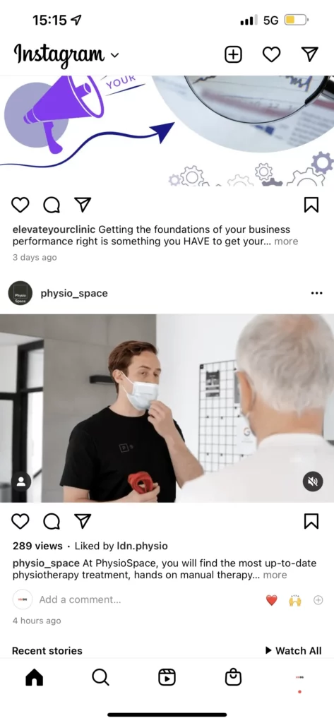
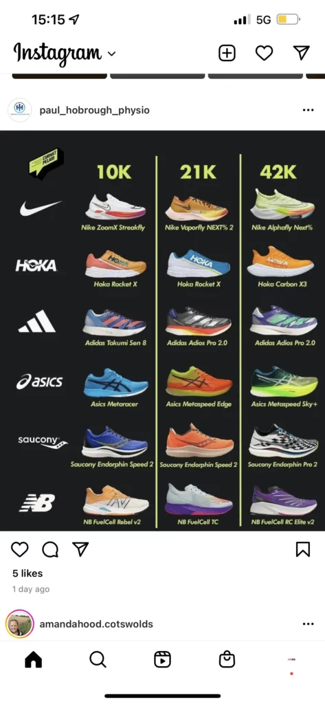
Let’s take a look at what we’re talking about. Here are two simple organic posts on Instagram. (They both happen to be customers of ours so one will get a pat on the back and the other a telling off Ed) 😉
Ignoring the colour for a moment, you’ll notice the one on the right takes up far more of the screen than the one on the left. Almost twice the size. When people are scrolling through their feed they’ll be 60%+ more likely to see the post on the right. It takes up almost the entire screen. It dominates the view. Physiospace have some incredible imagery but that’s no good if the image gets lost in amongst other posts.
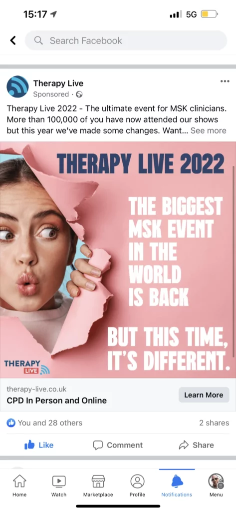
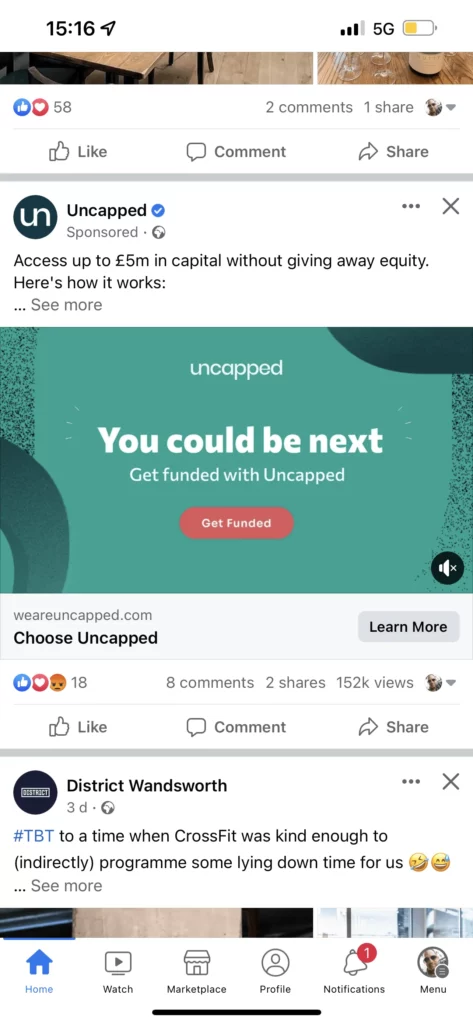
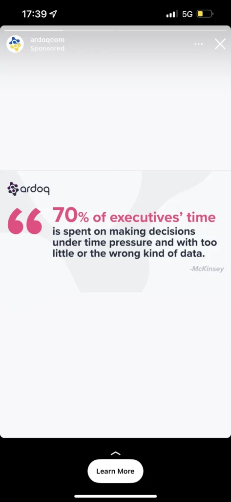
An ad for Therapy Live we created is on the left and an ad (from an incredible finance business that should know better might I add) on the right. You’ll immediately notice that the ad on the left takes up the entire screen. You can’t miss it. It’s also easier to read the text, the CTA button and the headline at the bottom. The question is, does this really matter? Yes, if you’re running ads you can lose thousands by not being careful with sizes and if it’s organic you’ll get less views.
When we run ads or posts for our healthcare customers we’ll always think about the app and the platform even before the messaging or branding. As much as Adam and Ben (subscribe to the BCP, it’s excellent) weren’t super pleased about having to practically hug it out for the Instagram stories post they did it and it’s worked brilliantly. You can see from this how we choose very different formats according to where the post features.
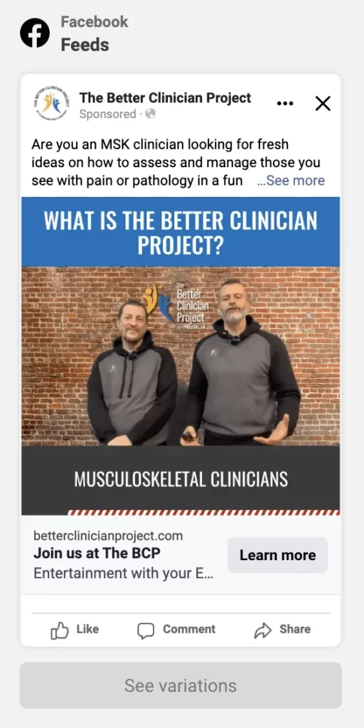
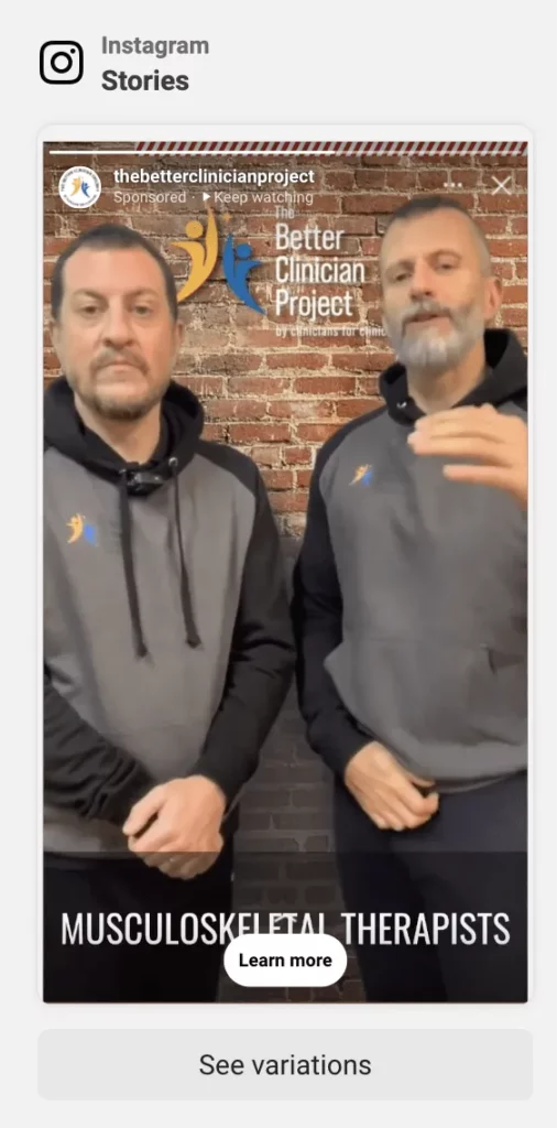
Also note, and this is a bugbear, if you’re going to do videos in portrait for stories, make sure you have captions. Very few people have their volume up when viewing stories so you need captions to properly communicate the message.
Here’s a simple example from Twitter on the desktop, well done Rahab Guru (although a caption with a message in the image would have improved it), not so well done Pure Physio!
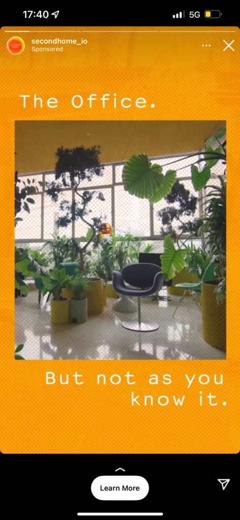
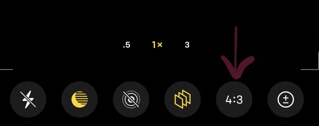
Click on that and you can change from 4:3 to portrait or landscape. Magic! When you’re taking a picture for socials ALWAYS hit this button and think about the size to select for where you’re posting.
So our advice is, don’t ruin your great messaging, great image or video by not thinking carefully about both the app and device the viewer will be using.
What’s next?
If you want to follow my Twitter and Instagram for fun then please do!
If you’d like to book in a call with me for a free 20-minute conversation about how HMDG can help your clinic then click here
If you find this article useful then please share on your socials!
